UX design south africa is the practice of shaping how people actually move through your website — and it affects conversions more directly than almost any other factor, because a visitor who cannot easily understand, navigate, or trust a page does not convert no matter how good the offer or the traffic behind it. Good UX is not decoration; it is the removal of every reason a ready buyer had to leave.
This guide explains how UX design decisions translate into conversion outcomes for SA businesses specifically, where mobile-first behaviour and local trust signals change what good design means. For the broader context, see our complete web design guide for Johannesburg businesses, and for the optimisation methodology that sits alongside design, the conversion rate optimisation guide.
Quick Answer
UX design south africa affects conversions because conversion is a function of friction, clarity, and trust — and UX design is the discipline that controls all three. The highest-impact levers, in order: clarity of the primary action (a visitor should know what to do within seconds of landing, with one obvious next step per screen); mobile-first interaction design (most local traffic is mobile on mid-range devices, so thumb-reachable controls, legible type, and forms that work one-handed are not optional); trust signalling appropriate to the South African market (local payment logos, real contact details, no broken or foreign-only elements that signal “not for you”); and reducing form and decision friction (every extra field, every ambiguous choice, every unnecessary step loses a measurable percentage of people who were going to convert). UX design does not replace conversion rate optimisation — CRO is the testing methodology that proves which design changes work — but design decisions are what create the conversion potential CRO then measures. The single biggest mistake is treating UX as visual styling: a beautiful site that buries the primary action or breaks on a mid-range Android converts worse than a plain one that does not.
Not sure whether your site’s design is quietly costing you conversions? We will tell you exactly where.
Get a Free UX Conversion ReviewUX Design South Africa: Why Design Decides Conversion
UX design south africa is best understood as conversion engineering, not visual decoration. Every conversion is the end of a path the visitor walked through your interface, and UX design is the discipline that decides whether that path is obvious or obstructed. A page can be visually impressive and still convert poorly if the design makes the next action unclear.
This reframes where conversion problems actually live, and it is the core of ux design south africa as a practice. When a site with good traffic and a sound offer underperforms, the cause is usually not the offer or the ad — it is a design decision somewhere in the path that quietly loses people. Finding and removing those decisions is the work, and it is design work, not marketing copy work.
Visually impressive is not the same as usable. A site can win a design award and still hide its primary call to action below an oversized hero animation, forcing the visitor to scroll and hunt. The aesthetic impresses other designers; the buyer who could not find the button simply leaves, and no amount of traffic fixes a path that obscures its own destination.
UX Design South Africa: The SA-Specific Constraints
UX design south africa carries constraints that generic design advice ignores, and ignoring them is how internationally-styled sites underperform locally. Effective design here starts from the local visitor’s real device and connection, not a designer’s desktop. The SA visitor context is mobile-dominant, device-constrained, and trust-sensitive in ways that change what good design means in practice.
Mobile-first is not a preference here
A large share of SA traffic arrives on mid-range Android devices over mobile data. Design decisions that assume a large desktop screen and a fast connection fail this audience silently — controls placed out of thumb reach, type too small to read without zoom, and forms that demand precise tapping all lose conversions invisibly because the visitor leaves rather than complains.
Trust signalling is locally specific
SA buyers read trust cues differently. A checkout showing only foreign payment options, a contact page with no local presence, or elements that visibly break signal “this is not really for South African customers” — and that perception ends conversions before price is ever considered. Local payment logos, a real local contact path, and a site that works end to end are design-level trust signals, not afterthoughts.
Design Friction Is Invisible Until You Measure It
The defining property of UX design south africa failures is that they are silent. A buyer who cannot find the button, cannot read the form on their phone, or does not trust the checkout does not send an email explaining why — they leave, and the analytics show only a slightly lower conversion rate with no obvious cause. This is why design problems persist for months: nothing alerts you to them. The only reliable way to surface them is to watch real SA users on real devices attempt the primary action, or to test design changes against a measured baseline. Assuming the design is fine because no one complained is assuming silence means success when it usually means the opposite.
Want to see your site through the eyes of a real SA mobile visitor before it costs you another month of conversions?
Get a Free SA Mobile UX WalkthroughUX Design South Africa: The Highest-Impact Levers
Not all UX decisions move conversion equally, and effort should follow the order of impact rather than the order of what is easiest to change. Prioritising this work by impact rather than by ease is what separates a redesign that moves revenue from one that just looks newer. The levers below are sequenced by how much they typically move conversion for local sites.
| UX Lever | What It Controls | Conversion Impact | SA-Specific Note |
|---|---|---|---|
| Primary action clarity | Whether the visitor knows the next step | Highest | One obvious action per screen |
| Mobile interaction design | Whether mobile users can act at all | Very high | Thumb reach, legible type, one-handed forms |
| Trust signalling | Whether the visitor believes the site | High | Local payment + contact cues |
| Form and decision friction | How much effort each step demands | High | Every field removed recovers conversions |
| Visual hierarchy | What the eye is guided toward | Moderate | Direct attention to the action, not away |
The pattern is consistent: the levers that decide whether the visitor can act at all sit above the levers that make acting prettier. According to Nielsen Norman Group’s ecommerce UX research, the bulk of conversion-affecting design guidance concerns clarity, navigation, and friction reduction — not aesthetic polish — which is exactly the order SA sites should prioritise given their mobile-constrained audience.
UX Design South Africa: Where It Sits Relative to CRO
UX design south africa and conversion rate optimisation are often confused, and the distinction matters for how you spend effort. Treating it as a one-off redesign rather than an ongoing conversion discipline is the most common framing error. UX design is the discipline that creates the conversion potential; CRO is the testing methodology that proves which design decisions actually realised it. They are partners, not substitutes.
Practically: UX design makes the considered decision about how a path should work; CRO tests that decision against a measured baseline to confirm it moved the number.
A site with strong UX design and no testing is probably converting well but cannot prove which choices mattered; a site running tests on a fundamentally confusing design is optimising the arrangement of obstacles. The conversion rate optimisation methodology works best applied on top of sound UX, not as a substitute for it.
UX Design South Africa: The Quiet Conversion Killers
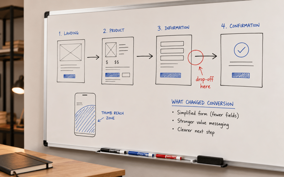
Beyond the high-impact levers, a recurring set of small UX design south africa mistakes drains conversion steadily rather than dramatically. They rarely cause an obvious collapse — they shave a few percent each, and together they explain why a site with good traffic and a sound offer still underperforms.
The first is the multi-action screen, and it is one of the most common ux design south africa errors. When a page presents three or four competing calls to action of equal visual weight, the visitor’s decision cost rises and a measurable share resolve it by doing nothing. One screen, one primary action is not a stylistic preference; it is a conversion mechanic.
The second is the form that asks for more than the moment requires. Every field added to a form removes a percentage of the people who would have completed it. A SA mobile visitor filling a form one-handed on data abandons a long form far faster than a desktop user, so each non-essential field is more expensive here than generic benchmarks suggest.
The third is unacknowledged slowness as a UX failure, not just a technical one. A visitor does not distinguish between a slow server and a confusing layout — both register as “this is hard” and both end the session. This is why UX design south africa overlaps with performance work; the disciplines are separate but the visitor experiences them as one thing.
Small Frictions Compound
The reason these design problems are so often missed is that no single one is fatal — a slightly buried button costs a few percent, an extra form field costs a few percent, a moment of doubt at checkout costs a few percent. Individually each is below the threshold anyone investigates. Compounded across the full path, they are frequently the difference between a site that converts and one that does not, while every individual element looks defensible in isolation. The discipline is auditing the path as a whole, not defending each screen on its own merits.
How Growth Pulse Media Approaches UX and Conversion
Most agencies treat UX as a visual redesign deliverable — a prettier site handed over with no measured connection to conversion. Growth Pulse Media builds web design work for South African businesses around the conversion path first and the aesthetic second, because a beautiful site that does not convert is a cost, not an asset.
The operator background behind GPM means design decisions are argued from conversion consequence, not design taste. A typical engagement maps the actual path a real SA visitor takes on a real device and identifies the specific decisions losing people.
It changes those decisions and measures the result, rather than declaring the redesign successful because it looks better. All work is executed in-house, so the person making the design call is the person who has to defend it against the conversion data.
Who This Guide Is NOT For
UX design south africa is the right focus for many sites, but not every situation, and being honest about that prevents misdirected spend.
Sites with no traffic problem to convert. UX design improves the conversion of visitors you already have. A site with almost no traffic has an acquisition problem first — perfecting the path for a handful of monthly visitors is optimising a funnel before anyone is in it, and the effort is better spent earning traffic until there is enough to convert.
Operators who want a redesign for its own sake. A redesign motivated by “the site looks dated” rather than by a measured conversion problem often changes things that were working. Without a baseline to protect, a visually-driven redesign can lower conversion while looking more modern, and nobody notices until revenue does.
Businesses unwilling to test design changes. UX design proposes; measurement disposes. An operator who wants the design opinion but will not measure whether it moved conversion is buying taste, not outcomes — and design decisions made without a feedback loop drift toward what looks good in a portfolio rather than what converts.
Sites whose real blocker is offer or price, not design. No interface fixes a product nobody wants at a price they will not pay. If qualified visitors reach a clear, usable path and still do not convert, the problem is upstream of design, and reworking the UX repeatedly will not move a number that price or positioning is holding down.
Ready to find out whether your conversion problem is design, traffic, or offer — before spending on the wrong one?
Get Your Free Conversion DiagnosisUX Design South Africa: Frequently Asked Questions
What is UX design and how does it affect conversions?
UX design is the practice of shaping how people move through a website — how clearly they understand it, how easily they navigate it, and how much they trust it. It affects conversions because every conversion is the end of a path through the interface, and design decisions determine whether that path is obvious or obstructed.
A visitor who cannot easily find the next step, use the site on their phone, or trust the checkout does not convert regardless of how good the offer or traffic is — making design a primary conversion factor, not a cosmetic one.
Why does UX design need to be different for South African websites?
Because UX design south africa operates in a visitor context that is mobile-dominant, device-constrained, and trust-sensitive in specific ways. A large share of local traffic is on mid-range Android over mobile data, so designs assuming large screens and fast connections fail silently.
SA buyers also read trust cues locally — foreign-only payment options or no local contact presence signal the site is not for them, ending conversions before price is considered. Generic international design advice misses both constraints.
What is the difference between UX design and CRO?
UX design is the discipline that creates conversion potential by deciding how a path should work. Conversion rate optimisation is the testing methodology that proves which of those design decisions actually moved the number against a measured baseline.
They are partners, not substitutes. Strong UX with no testing converts well but cannot prove what mattered; CRO on a fundamentally confusing design just optimises the arrangement of obstacles. CRO works best applied on top of sound UX.
What is the highest-impact UX change for conversions?
Clarity of the primary action. A visitor should know what the single next step is within seconds of landing, with one obvious action per screen. This sits above every other UX lever because if the visitor cannot tell what to do, nothing else in the design gets a chance to work.
After that, in order: mobile interaction design, trust signalling, and form or decision friction reduction — the ux design south africa priority stack. Visual hierarchy supports these but does not substitute for them.
How do I know if my site has a UX problem?
UX problems are silent — visitors who cannot find the action, read the form on their phone, or trust the checkout leave without explaining why, so analytics show only a slightly lower conversion rate with no obvious cause. That silence is exactly why the problems persist.
The reliable way to surface them is to watch real SA users on real devices attempt the primary action, or to test design changes against a measured baseline. Assuming the design is fine because nobody complained usually means the opposite.
Is a redesign always the answer to low conversions?
No. Low conversions can come from a traffic problem, an offer or price problem, or a design problem, and a redesign only fixes the third. Redesigning a site whose real blocker is price or positioning changes things that were working without moving the number.
The correct first step is diagnosing which of the three is actually constraining conversion, which is where ux design south africa work properly begins. A redesign motivated by appearance rather than a measured design problem can lower conversion while looking more modern.
Get a UX Conversion Diagnosis for Your SA Site
Growth Pulse Media will map the actual path a real South African visitor takes through your site on a real device, identify the specific design decisions losing conversions, and tell you honestly whether your problem is UX, traffic, or offer before you spend on a redesign. Built by operators who argue design from conversion consequence, not design taste. No obligation — we will get back to you within 24 hours.
Get Your Free UX Conversion Diagnosis