
 Add to Preferred Sources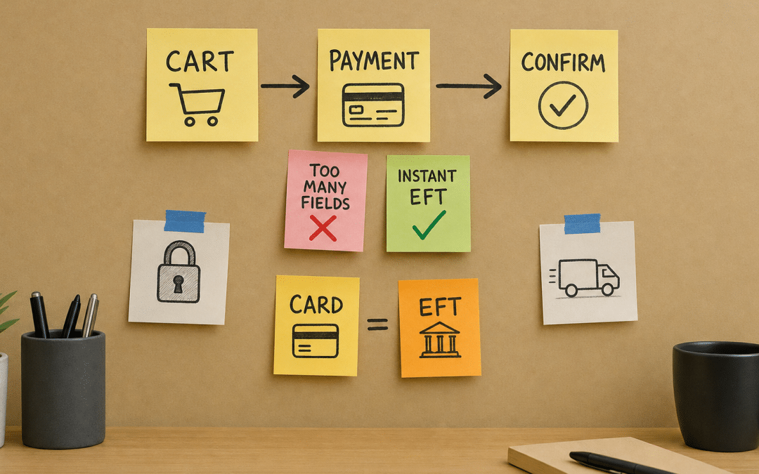
Checkout page optimisation is the single highest-leverage activity on any South African ecommerce store — more impactful than a new ad campaign, a redesigned homepage, or a better product description. If you want to understand the full conversion picture first, read our CRO guide for South Africa before diving into the payment page specifics covered here.
Baymard Institute's aggregated data across 50 studies puts the average cart abandonment rate at 70.22% — meaning seven in ten shoppers who add to cart never pay.
That number is worse in the South African context. Local shoppers carry additional friction points that global benchmarks don't account for: EFT preference over card, trust gaps around card security, and courier coverage anxiety for addresses outside the major metros. SA-specific abandonment drivers layer on top of the universal ones, which means the gap between a default checkout and an optimised one is wider here than it is for a UK or US retailer.
Quick Answer
Checkout page optimisation means systematically removing every form field, trust gap, payment-method gap, and error state that causes a shopper to leave before paying. In South Africa, that specifically means surfacing PayFast, Peach Payments, or Ozow instant EFT options prominently, reducing form elements to the minimum POPIA-compliant set, and showing courier options with honest metro versus peri-urban delivery windows.
Do you know which payment method your checkout is losing the most sales on?
Get a Free Checkout AuditWhy Checkout Page Optimisation Fails Most SA Stores
It fails when store owners treat the payment page as a technical necessity rather than a conversion surface. Most Shopify stores in South Africa ship with a default checkout that was designed around a US or UK shopper: credit card as the primary method, a single address-validation format, and a guest-checkout prompt that still feels like an account wall.
Baymard's research identifies 17% of shoppers abandoning specifically because the checkout process felt too long or complicated. Their large-scale usability testing found an ideal checkout can be completed with 12–14 form elements total, yet the average checkout presents 23.48 by default. That gap is entirely avoidable through deliberate design decisions.
In South Africa, two additional failure modes compound the global ones. First, many stores integrate a payment gateway but surface only card as the visible option — hiding instant EFT behind a secondary dropdown. Shoppers who prefer Ozow or SnapScan simply leave. Second, courier integration often shows a single flat rate with no suburb-level honesty, which creates post-purchase cancellations from buyers in Polokwane or Queenstown who discover the quoted window was a Gauteng estimate.
Key Insight
Hiding instant EFT behind a secondary dropdown is functionally the same as not offering it. If your checkout requires two taps to find Ozow, a material share of EFT-preferring shoppers will treat it as unavailable.
The Checkout Page Optimisation Framework: Six Layers
This process has a logical sequence — fix the structural issues first, then the trust signals, then the payment methods, then the post-checkout flow. Jumping straight to A/B testing button colours before addressing a 14-field form is a waste of test traffic.
Layer 1 — Form reduction. Audit every field. Shipping address is required. A separate billing address should default to "same as shipping" with a single tick to override. Company name, phone, and address line 2 should be optional, not required. POPIA requires you collect only what is necessary for the transaction — an over-fielded form is not just a UX problem, it is a data minimisation compliance risk.
Layer 2 — Payment method visibility. Your gateway's available methods should all be presented at the same visual weight on the first screen. PayFast supports card, instant EFT, Mobicred, and MoreTyme. Peach Payments adds SnapScan and 1Voucher. Ozow's entire value proposition is the instant EFT flow. If your integration only shows one card form, you are paying gateway fees for capabilities you are not converting.
Layer 3 — Trust signals at the payment moment. A padlock icon in the browser bar is invisible to most shoppers. What works: a visible "secured by [gateway name]" badge adjacent to the pay button, a clear returns policy summary (not a link — a summary), and card logos at the point of payment entry. Baymard's research flags that 19% of shoppers have abandoned because they did not trust the site with their card details.
Layer 4 — Delivery transparency. Show carrier options with named windows: "The Courier Guy — 2–3 business days to Johannesburg/Pretoria/Cape Town; 4–6 days to other areas." Aramex covers more of the country than most shoppers expect, but only if you say so. Vague language like "3–7 business days" performs worse than specificity even when the specific window is longer.
Layer 5 — Error handling. A declined card should surface a message that distinguishes between "card details incorrect" and "insufficient funds" and suggests the instant EFT alternative in the same error state. Most SA stores return a generic gateway error. That is a recoverable abandonment that goes unrecovered.
Layer 6 — Post-purchase confirmation. The order confirmation page is the cheapest upsell surface on your store. A clear order summary, a trackable courier reference, and a single relevant product recommendation at the bottom of the confirmation email adds revenue with no ad spend.
Which of these six layers is costing your store the most revenue right now?
Get a Free Payment Page ReviewCheckout Page Optimisation: Payment Method Comparison for SA Stores
Choosing and configuring the right gateway is a foundational decision for conversion. The table below compares the three dominant options across the criteria that matter most for checkout page optimisation.
| Gateway | Instant EFT | Card Processing | Buy-Now-Pay-Later | Shopify Native | Best Fit |
|---|---|---|---|---|---|
| PayFast | Yes (via bank redirect) | Yes | Mobicred, MoreTyme | Yes (official app) | General retail, mid-market |
| Peach Payments | Yes (via Ozow, SnapScan) | Yes | PayJustNow | Yes (official plugin) | Higher-volume stores, B2B |
| Ozow | Yes (core product) | No | No | Yes (app) | EFT-first stores, high ticket |
The right answer for most stores is not to choose one — it is to stack a full-service gateway like PayFast or Peach Payments as the primary integration, and to surface instant EFT as an equally prominent option on the payment selection screen, not nested inside a "more options" accordion.
Before and After: What Checkout Page Optimisation Actually Moves
The figures below illustrate the pattern we see, not a guaranteed outcome. Real results depend on your traffic volume, product category, baseline checkout quality, and how aggressively you implement each layer.
| Metric | Before Optimisation | After Optimisation |
|---|---|---|
| Form fields displayed | 22 fields (default Shopify + billing) | 11 fields (required only) |
| Checkout-to-payment conversion | 38% | 54% (+42% relative improvement) |
| EFT payment share | 8% (buried in dropdown) | 27% (equal visual weight) |
| Card-decline recovery rate | 3% (generic error) | 19% (EFT alternative surfaced) |
| Monthly revenue (R85k baseline) | R85,000 | R121,000 (+R36,000) |
The R36,000 monthly uplift in the example above required no additional ad spend and no new products. It came entirely from conversion rate optimisation applied at the payment layer. That is the economic case for treating checkout page optimisation as a priority project rather than a backlog item.
Mobile Checkout: The Friction Multiplier
Optimising the payment page on desktop is straightforward. On mobile, every friction point costs roughly twice as much because the input overhead is higher and the patience threshold is lower. South African ecommerce skews heavily mobile — a high proportion of sessions arrive on data-constrained connections, often on mid-range Android devices.
Practical mobile-specific fixes: replace text input for card number with a numeric keypad trigger (type="tel" or type="number" on the input element). Use Google Address Autocomplete for the shipping address field — it reduces the suburb/city/postal-code entry to a single search. Ensure your payment gateway's mobile redirect flow returns the shopper to your confirmation page, not to a browser back-state that shows an empty cart.
For A/B testing your checkout on mobile, segment your test traffic by device type from day one. A change that lifts mobile conversion by 12% can simultaneously reduce desktop conversion if the layout shifts were not device-specific. Test them separately.
Key Insight
A mobile checkout that requires manual suburb and postal code entry on a mid-range Android device is not a checkout — it is a filter. Address autocomplete is not a nice-to-have; it is a conversion fix.
POPIA and the Checkout Form: What You Actually Need to Know
Payment page optimisation and POPIA compliance are not in tension — they reinforce each other. POPIA's data minimisation principle requires you to collect only personal information that is adequate, relevant, and not excessive for the purpose of the transaction. A checkout form that asks for ID number, date of birth, or company registration number when selling consumer goods is not compliant — and it loses sales.
What you are required to collect: enough to fulfil the order (name, shipping address, contact number or email for courier updates) and enough to process payment (handled by your gateway, not stored on your server). Practices commonly interpret POPIA as requiring a clear privacy notice link on the checkout page, consent acknowledgement before submission, and an unambiguous statement of how order data is used.
The Information Regulator has enforcement powers for non-compliance. More practically, a non-compliant or over-collecting checkout form creates a trust deficit at the exact moment you need trust most. Get the form right and you satisfy both requirements simultaneously.
GPM's Approach to Checkout Page Optimisation
At Growth Pulse Media, checkout page optimisation starts with a structured audit — not a heuristic opinion, but a page-by-page review of your form field count, payment method surfacing, trust signal placement, mobile input behaviour, and error-state copy. We map every step from "add to cart" through to the order confirmation email.
We built and scaled an SA ecommerce business before we built an agency, which means we have sat on the merchant side of a PayFast integration at 11pm wondering why card declines weren't recovering. That context shapes how we audit: we look for the fixes that move the revenue line, not the ones that make the checkout look tidy in a Figma file.
Our conversion rate optimisation service covers the full funnel — from landing page through to checkout — with SA payment context built in from the start. The checkout audit is the starting point; the testing roadmap is where the compounding gains come from.
Who This Is NOT For
Stores not yet at meaningful traffic volume. Checkout page optimisation requires enough sessions to generate statistically valid test results. If your store receives fewer than a few hundred checkout initiations per month, prioritise traffic acquisition first. Optimising a low-traffic checkout is rearranging a room nobody is visiting.
Businesses that haven't fixed their product-market fit. If shoppers are abandoning before they even reach the checkout — bouncing from product pages or leaving the cart empty — the problem is upstream. Read our landing page optimisation guide before touching the payment page.
Stores unwilling to surface multiple payment methods. If your business model or gateway contract restricts you to card-only processing, the SA-specific gains from this work are materially reduced. The EFT recovery and instant-EFT surfacing layers account for a significant share of the local uplift. Card-only checkout optimisation still helps, but less so.
Teams committed to a once-off fix rather than an ongoing programme. A checkout audit and a round of fixes will move the needle. But conversion rate gains compound only when you run systematic tests over time. If your team won't allocate time to a monthly testing cadence, the one-time improvement will erode as your traffic mix and product range evolve.
Ready to find the exact fields and payment gaps that are costing your store money every day?
Get a Free Checkout Optimisation PlanCheckout Page Optimisation FAQ
What is checkout page optimisation and why does it matter for South African stores?
It is the process of systematically removing friction from every step between "proceed to checkout" and a completed payment. It matters especially in South Africa because local shoppers face friction points — EFT preference, card security distrust, courier uncertainty — that global checkout defaults were never designed to address. Baymard Institute's aggregated data puts average cart abandonment at 70.22%, and SA-specific conditions can push that figure higher on unoptimised stores.
Which payment gateways are best for checkout page optimisation in South Africa?
PayFast and Peach Payments both offer broad method coverage — card, instant EFT, and buy-now-pay-later options — and have official Shopify integrations. Ozow is the best standalone choice for stores where instant EFT dominates the customer base. The optimisation lever is not which gateway you choose, but whether all available methods are presented at equal visual weight on the first payment screen rather than buried in secondary menus.
How many form fields should a South African checkout have?
Baymard's usability research shows an ideal checkout can work with 12–14 form elements, while the average store defaults to over 23. For a South African store, a compliant minimum set is: first name, last name, street address, suburb, city, province, postal code, email, and phone. Billing address should default to "same as shipping." Every additional required field reduces conversion.
How does POPIA affect what I can collect on a checkout form?
POPIA's data minimisation principle means you should collect only what is necessary to fulfil the order and process payment. Practices commonly interpret this as requiring a privacy notice link on the checkout page and a clear statement of how order data is used. Collecting ID numbers, dates of birth, or other non-transactional data on a retail checkout form creates both a compliance risk and a trust deficit at the payment moment.
What is the fastest checkout page optimisation win for a Shopify store?
For most SA Shopify stores, the fastest win is surfacing instant EFT at equal visual weight to card on the payment selection screen. This typically requires a gateway configuration change rather than a development build. The second fastest is enabling Google Address Autocomplete on the shipping address field, which removes the single biggest mobile input bottleneck. Both can often be implemented in a single working day.
How do I measure whether my checkout page optimisation changes are working?
Track checkout-to-payment conversion rate as a standalone metric in Google Analytics 4, segmented by device type and payment method. Set up a funnel exploration that shows drop-off at each checkout step — form entry, payment selection, payment submission, and confirmation.
Run changes as controlled A/B tests where traffic volume allows, and give each test enough sessions to reach statistical significance before calling a winner. Our A/B testing guide for South Africa covers sample size calculation in detail.
Want to know exactly where your checkout is losing revenue?
We will audit your payment page end to end and deliver a prioritised action plan — covering form structure, payment method surfacing, mobile input, trust signals, and error-state recovery. No obligation — we'll get back to you within 24 hours.
Get Your Free Checkout Audit