
 Add to Preferred Sources
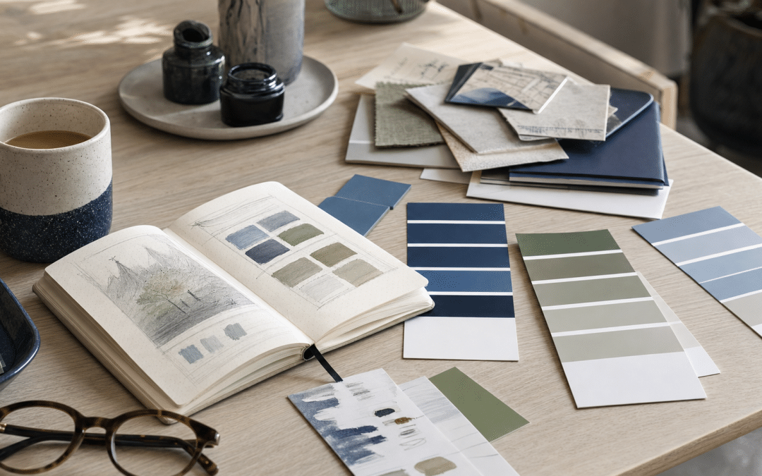
Brand colours are the small, fixed set of hues a business repeats across its logo, website, packaging and adverts so customers recognise it at a glance. The experimental evidence that a given hue triggers a given emotion is thin and context-dependent, so the dependable work is practical: fit to your category, consistency and legibility. That matters for anyone working through branding in South Africa, because most colour advice online is a hue-to-emotion cheat sheet that the studies cited below do not back.
This post separates what the evidence supports from what it does not, then turns it into a decision table you can apply to a real palette. It is written for owners and marketers who need to choose or audit a palette and defend the choice to a designer, a printer or a business partner.
Quick Answer
The studies checked for this post point to hue effects that depend on context rather than a universal meaning, so the best brand colours are the ones that suit your category, stay consistent everywhere, and stay readable on a phone. Choose an anchor colour that fits what customers expect from your sector, add one accent for actions, and test the palette in context before you print or publish anything.
Jump to
Unsure whether your current palette is working against you?
Send us your website and we will point out where the palette and layout may be costing you enquiries.
Request a Free ConsultationHow Do Brand Colours Affect Customer Behaviour?
Brand colours affect behaviour by shaping first impressions, signalling what category you belong to and making you recognisable across touchpoints, but the size and direction of the effect depend on the situation the customer is in.
A 2012 laboratory study in PLoS ONE by Meier and colleagues shows why. Participants viewed photos of opposite-sex individuals wearing red or blue shirts and then walked to an interview, with walking speed as the measure. Red increased the speed of walking to an interview about dating but decreased it for an interview about intelligence, and the authors conclude that red's influence "varies by psychological context".
The same hue pushed walking speed in opposite directions depending on the setting. This was not a marketing experiment, so it is an analogy and not evidence about banners or websites. It still warns against assuming a hue has one fixed effect, and it is the reason this post treats colour as a fit question.
Takeaway
A hue does not carry one fixed message. Its effect on a customer depends on the situation, the product category and what the buyer already expects, so the question to ask is "does this fit what we sell?" rather than "what does this colour mean?"
What Does the Research Actually Support About Hue Meanings?
Brand colours psychology supports three limited claims: hues are loosely associated with brand personality, those associations depend on context, and a hue works best when it fits the product it sits on.
As summarised by DeepMarketing, Labrecque and Milne's 2012 paper in the Journal of the Academy of Marketing Science links red to excitement and blue to competence, and Elliot and Maier's 2014 review in the Annual Review of Psychology finds that colour effects vary with saturation, brightness, product category and cultural meaning. The same summary says consistency between a hue and perceived brand personality predicts preference better than the hue itself.
The table scores the claims you will meet most often against that evidence.
| Common claim | What the evidence shows | Verdict |
|---|---|---|
| Red creates urgency and excitement | Labrecque and Milne are summarised as linking red to excitement. The separate PLoS ONE walking experiment found red's effect on walking speed reversed between a dating and an achievement context. | Context-dependent. Use it where energy suits the offer, not by default. |
| Blue builds trust and competence | Summarised as an association with competence. That is an association in a study, not proof that blue makes buyers trust you. | A reasonable fit for sectors that sell reliability. Not a guarantee of trust. |
| One button colour converts best | No source checked for this post shows a universal winning button colour. The research above tested other things, such as shirts and brand personality. | Test against your own page. Do not copy someone else's winner. |
| Colour drives most of a buying decision | DeepMarketing's summary says a widely quoted 2006 paper by Singh covers the first visual impression overall, which includes shape, layout and typography, and is not a colour-to-sales figure. | Treat any such percentage as unproven for your business. |
| South Africans need a different palette from everyone else | A small 1991 study of 26 urbanised black South Africans found associations that corresponded to Western studies and did not appear to reflect ethnic differences based on traditional beliefs. | Do not assume. Check with your own customers. |
Do Hue Meanings Change for South African Audiences?
The South African evidence available is thin, and what exists does not support a distinct "SA colour code". K. W. Grieve of the University of South Africa studied 26 urbanised, educated black South Africans, 11 men and 15 women, and reported that black and red were the preferred colours. In general the associations corresponded to those of Western studies and did not appear to indicate ethnic differences based on traditional beliefs.
The abstract adds that "the particular significance of colour cannot be separated from the context in which it is observed" and flags limitations in the data. It is a 1991 sample of 26 people, so it says little about a modern customer base. Its useful message is negative: there is no basis here for importing a "what colours mean in each culture" infographic onto a mixed South African audience.
Working rule of thumb: before changing a palette because of a cultural claim, show five customers from your actual market the palette and ask what they think the business sells. Treat the answers as a qualitative sanity check, not a measurement. If they describe something far from your offer, look at fit before you look at culture.
How Should You Choose a Palette When You Have Real Constraints?
A palette decision should start from your constraints, because the constraint that binds hardest usually rules out most of the options before taste comes into it. The table below maps six common constraints to what each one changes and the move that follows.
| Constraint | What it changes | Practical move | Best for |
|---|---|---|---|
| You sit among similar competitors in search results or on a shelf | Whether to match the category or stand apart | Line up your five closest competitors side by side. Keep the category's anchor hue only if recognition is your priority over distinction, otherwise differentiate with the accent. | Crowded sectors such as finance, health and trades |
| Text sits on coloured backgrounds, read mostly on phones | Which pairs are legible | Check each text and background pair against the WCAG 2.2 AA minimum of 4.5:1 for normal text and 3:1 for large text. Text that is part of a logo has no contrast requirement, but body text, links and button boundaries do: interface components need at least 3:1 against adjacent colours. Our brand colour contrast checker guide shows how. | Any business with a website or email |
| Part of your audience has colour vision deficiency | Whether colour alone can carry meaning | The US National Eye Institute says about 1 in 12 men have colour vision deficiency, most often confusing red and green. Add an icon or a label next to every red/green status signal. | Stores, dashboards, forms and booking flows |
| Printed packaging, uniforms or signage | How the hue is specified and approved | Screens and printed stock render the same hue differently, so approve a physical proof before the full run. See packaging design costs in South Africa for what proofing adds. | Product brands, restaurants, retail |
| Mixed audiences across language, age and culture | How much weight to give any single meaning | Rely on category fit and customer feedback rather than a cultural cheat sheet. | National and multi-region businesses |
| Many people produce your content | Whether the palette survives being used by non-designers | Store exact codes in a shared kit. Our Canva brand kit setup guide covers the mechanics. | Teams, franchises, agencies and freelancers |
Takeaway
Palette choice is a constraint problem before it is a taste problem. Competitor lineup, legibility on phones, colour vision deficiency and print proofing remove most options, and what is left is where personality can decide.
Palette picked but the website still not converting?
Tell us which pages matter most and we will check whether colour and layout are helping or hiding your calls to action.
Book a Free AuditHow Many Colours Should a Small Business Palette Contain?
A small business palette works best when each colour has one defined job, because a colour with a job can be applied consistently by anyone and a colour without one gets used at random. As a working rule of thumb rather than a measured standard, three to five colours cover most needs: an anchor, a supporting neutral, an accent for actions, and optional extras for charts or seasonal work.
- Anchor colour: the hue people should associate with you. It appears in the logo, headers and large surfaces.
- Neutrals: the backgrounds and body text colours. They carry most of the page, so legibility is decided here.
- Action accent: one hue reserved for buttons and links. Keeping it exclusive is what makes it stand out.
- Status colours: only if your product needs success or error states, always paired with an icon or text.
Whether you are settling on brand colours for a website or for packaging, record each hue as a hex code for screens and a print specification for suppliers, and keep them in one shared document.
In our judgement, a palette that drifts between your website, Instagram and invoices undermines the recognition it exists to build. Consistent brand details are also a theme of our AI search brand consistency checklist.
How Do You Test a Palette Before Committing to It?
Testing a palette means checking it in the real places customers will meet it, because a swatch on a mood board behaves differently from a button on a phone in daylight. The tests that cost little are also the ones most likely to catch a problem.
- Squint test on a phone. Open your homepage on a real handset, lower the brightness and check whether the main button and headline still stand out. Your GA4 device report shows how many of your visitors are on phones to begin with.
- Competitor lineup. Put your logo and homepage screenshot next to your closest competitors. If a customer could not tell which is yours, the palette is not doing recognition work.
- Contrast check. Run each body text, link and large-text pair through a checker against 4.5:1 for normal text and 3:1 for large text, and check button boundaries against 3:1. Logo text is exempt.
- Colour-blind simulation. Use a free simulator in a browser's developer tools or a design app to see whether red/green signals still read.
- Five-customer interview. Show the palette without the logo and ask what the business sells and how established it seems.
Be careful with live A/B tests of button or banner colours. On a low-traffic page, a result is noise with a story attached, and the effect from a colour change is likely to be smaller than the effect of clearer copy or a shorter form. Our conversion-focused web design guide covers the layout side, and website UX for South African users covers how local visitors use sites.
Planning to apply a new palette across site, ads and email?
Share your timeline and the channels involved and we will map the order that avoids a patchwork rollout.
Book a Free AuditWhy South African Businesses Choose Growth Pulse Media
Dirk van Greuning built and scaled a large South African ecommerce business before founding Growth Pulse Media in Johannesburg, so the advice comes from an operator rather than a copywriter. All work is executed in-house, and a limited client load keeps senior attention on each account.
If a new palette needs to be applied to a site, our web design service is where that work is scoped, and for ecommerce, GPM is a registered Shopify Partner. If you are only budgeting for artwork, see graphic design rates in South Africa first.
Who This Is NOT For
This post is the wrong fit for readers who want certainty or a full identity project, and three situations stand out.
You want one colour that guarantees more sales. No verified evidence supports a single winning hue. If you need a guarantee, this post will disappoint you.
You need a full brand identity built from nothing. This post helps you choose and audit a palette. It is not a substitute for a naming, logo and identity project.
You have almost no traffic and want to A/B test button colours. The sample will be too small to tell you anything. Fix clarity of copy and contrast first, and test later.
Brand Colours FAQ
The questions below are the ones South African owners most often ask when they set or review a palette.
What are brand colours?
Brand colours are the fixed set of hues a business uses repeatedly across its logo, website, packaging and advertising so customers recognise it. A typical set has an anchor colour, neutrals and one accent for actions.
Does brand colour psychology really work?
Brand colour psychology works in a limited, context-dependent way. Studies link hues to brand personality, but in a 2012 PLoS ONE walking experiment red increased walking speed towards a dating interview and decreased it towards an intelligence interview, which suggests a hue's effect depends on context.
How do I choose brand colours for my business?
Start with your constraints: what your closest competitors use, whether text will be readable on phones, whether any signals rely on red versus green, and how the colours will print. Then pick an anchor colour that fits your category and one accent for actions, and test it with customers.
How many brand colours should I use?
As a working rule of thumb, three to five is enough for most small businesses: an anchor, a neutral, an action accent and optional extras. Each colour should have one defined job so anyone on your team can apply it consistently.
Do colours mean different things in South Africa?
They can, but the evidence is thin. A 1991 study of 26 urbanised black South Africans found associations that corresponded to Western studies, with no apparent ethnic differences based on traditional beliefs, and stressed that significance depends on context. Check your own audience rather than relying on a cultural cheat sheet.
Need a Second Opinion on Your Palette and Website?
Growth Pulse Media works with Shopify, GA4, Google Ads and Meta Ads. Tell us what you are launching and we will review how your colours behave across your site and channels. No obligation — we’ll get back to you within 24 hours.
Get Your Free Consultation