
 Add to Preferred Sources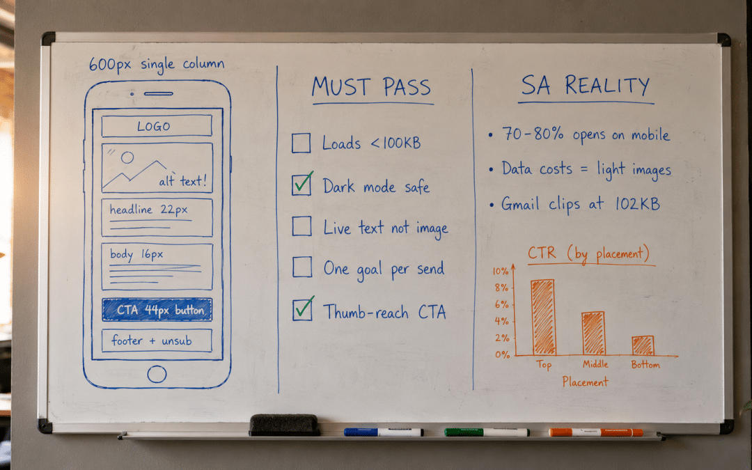
Email design South Africa best practices come down to five rules: single-column 600px layout, live text over image-only builds, a 44px+ thumb-reach button, weight under 100KB, and dark-mode-safe colours — the fundamentals behind every send in our email marketing South Africa guide. Get these right and the same list earns measurably more clicks. Below: each standard, the SA-specific reasons behind it, and how layout feeds the wider SA strategy playbook.
Quick Answer
Email design South Africa standards exist because 70-80% of SA opens happen on mobile, often on metered data. That means single-column layouts at 600px, live HTML text rather than images, one goal per send, a bulletproof button in thumb reach, and weight under 100KB so Gmail does not clip. Follow the checklist and click-through typically lifts 30-80% on the same list. The mistake is building on a desktop monitor for readers on phones.
Not sure why your beautiful campaigns earn so few clicks? We can show you in one session.
Get a Free Template ReviewEmail Design South Africa: The Standards That Decide Revenue
The email design South Africa checklist is short and unforgiving: every rule below exists because breaking it measurably costs clicks, and none requires a graphic artist to apply. Treat the table as the minimum standard for every send — flows and campaigns alike.
| Standard | The Rule | Why It Matters |
|---|---|---|
| Layout width | Single column, 600-640px | Renders cleanly on every client and phone |
| Body text | Live HTML text, minimum 14-16px | Readable when images are blocked; screen-reader safe |
| Primary button | Bulletproof, 44px+ tall, above the fold | Thumb-reach tapping on mobile |
| Total weight | Under 100KB, images compressed | Gmail clips at 102KB; SA data costs punish heavy sends |
| Colour and mode | Dark-mode tested, 4.5:1 contrast | A third of readers view in dark mode |
| Structure | One goal, inverted pyramid | Scannable in under 8 seconds |
These are not opinions — they are the consensus of rendering research. The Litmus best-practice guide, built on testing across 100+ clients and devices, lands on the same fundamentals: content-first modular layouts, live text, simple structure, and relentless pre-send testing. What changes locally is the weighting — and that is where SA senders gain an edge.
Why the SA Context Changes the Weighting
SA readers open on mobile more often, on slower connections, and on metered data more frequently than US or European benchmarks assume. Each of those realities promotes a global nice-to-have into a local must-have.
Mobile share and thumb reach
With 70-80% of SA opens happening on a phone, the mobile rendering is the primary rendering — the desktop view is the edge case. That means a single column that never forces pinch-zoom, headlines at 20-22px, body copy at 16px, and the primary button placed where a thumb naturally rests. Left-aligned copy with line height of 1.5-2 keeps long paragraphs scannable on a small screen.
Data costs and load weight
Metered mobile data remains a real constraint for a large share of SA subscribers, so heavy image-laden sends get abandoned before they finish loading. Compress every image, cap the total under 100KB, and never ship a message that is one giant graphic. Image-only builds also fail silently: when a client blocks images, the reader sees nothing at all — no offer, no button, no reason to click.
Dark mode and older clients
The practical fixes are simple once the failure modes are known: logos as transparent PNGs with a subtle light outline, buttons built from HTML with a background colour the inversion cannot strip, and body copy in near-black rather than pure black so the automatic swap lands on a readable grey. Ten minutes of prevention per template beats discovering the breakage in a customer screenshot.
Roughly a third of readers now view messages in dark mode, which inverts backgrounds and can make dark logos or low-contrast buttons vanish. Test both modes before every send. Meanwhile Outlook's rendering engine still mangles modern CSS, which is why table-based structure and bulletproof buttons remain the professional standard rather than a legacy habit.
Client mix matters too. Gmail and Apple Mail dominate SA consumer inboxes, with Outlook heavily represented in B2B — three engines with meaningfully different rendering behaviour. A template that has only ever been previewed in the sender's own client is untested by definition. Preview across at least those three, in both display modes, before any send that matters.
The Mobile-First Insight
Build the phone version first and let desktop inherit it — never the reverse. A layout that reads perfectly at 360px wide reads perfectly everywhere, while a desktop-first build almost always breaks somewhere on mobile. For SA senders the maths is simple: when four out of five opens are on a phone, the mobile rendering is not a variant to check at the end. It is the product.
Want your current template stress-tested against every rule on this page?
Request a Free Rendering AuditThe Anatomy of a High-Click Layout
Every high-performing send follows the same skeleton, top to bottom. The order is deliberate — it mirrors how a reader scans in the first eight seconds, which is roughly all the attention a promotional message earns.
Envelope first: sender name, subject line, and preview text do the opening work together. Keep subjects under 45 characters for mobile truncation and write the preview text deliberately — the client will otherwise pull whatever text comes first, which is often "View in browser".
Preview text deserves its own line item: the 40-90 characters shown beside the subject in the inbox list. Written deliberately, it extends the subject's hook; left to chance, it pulls whatever renders first. A hidden preheader block at the top of the build gives full control, and pairing subject and preview as a single two-part hook is one of the highest-leverage copy habits a sender can adopt.
Hero and headline: one compressed hero image with descriptive alt text, then a live-text headline stating the single message of the send. The inverted pyramid applies: conclusion first, supporting detail after. If the reader stops here, they should already know the offer.
Body and hierarchy: short paragraphs, generous white space, one idea per block. Visual hierarchy — size, weight, and colour used consistently — lets a scanner reconstruct the whole message from headlines alone. Every extra competing element taxes the click-through rate.
The button: one primary call-to-action, built as a bulletproof HTML button rather than an image, in a contrast colour reserved for it alone. Action-first copy ("Claim the offer", "Book the tasting") beats "Click here" consistently. Secondary links are fine; a second competing button is not.
Fonts and typography: web-safe stacks — Arial, Georgia, Verdana, Helvetica — render identically everywhere; custom brand fonts need a web-safe fallback declared or Outlook substitutes Times New Roman without asking. Hold body copy at 16px, headlines at 20-24px, line height at 1.5-2, and left-justify everything. Centre-justified body copy reads elegantly in a mock-up and exhaustingly on a phone.
Modular systems: the professional shortcut is a small library of reusable blocks — header, hero, product row, testimonial, footer — mixed per campaign rather than rebuilt from scratch. Modular builds cut production time roughly in half, keep every send on-brand, and mean a fix made once propagates everywhere. Build the library once; benefit every week after.
Footer: physical address, a working unsubscribe, and consent context — POPIA requirements, not decoration. A clean footer also signals legitimacy to mailbox providers, quietly supporting deliverability. Our POPIA compliance guide covers the legal layer in full.
Before and After: What the Standards Change
The table below reflects the typical trajectory for an SA retailer moving from an image-heavy, desktop-first template to a standards-compliant rebuild, measured over two to three months on the same list. Figures are indicative composites from SA benchmark ranges.
| Metric | Before (image-heavy, desktop-first) | After (standards-compliant rebuild) |
|---|---|---|
| Click-through rate | 1.0-1.5% | 2.2-3.5% |
| Revenue per campaign (R250k store) | R6,000-R9,000 | R14,000-R22,000 |
| Mobile readability failures | Frequent pinch-zoom, clipped content | Zero — single column renders clean |
| Load weight | 350-600KB, Gmail clipping | Under 100KB, no clipping |
| Dark-mode breakage | Logo and button invisible | Tested safe in both modes |
The One-Goal Rule
The highest-leverage layout decision costs nothing: one send, one goal, one button. Every additional offer, banner, and competing link divides attention and measurably lowers the click-through on the thing that matters. If the brief has three goals, that is three sends — and the automated versions of each will out-earn the crammed single version. Restraint is the cheapest optimisation in the entire discipline.
Testing and Measurement Discipline
Strong senders treat layout as a measurable system, not a taste debate. Track click-through rate, click-to-open rate, and revenue per send by template version — never "it looks better" as a conclusion. Click-to-open isolates the layout's contribution: the subject line earned the open, so what happens next belongs to the build.
A/B test one variable at a time — button colour, hero versus no hero, long versus short body — and let each test run to statistical meaning before declaring a winner. Template changes tested this way compound: three winning tests a quarter, each worth 10-15%, transform a programme within a year without touching the list or the offers.
Pre-send checks are non-negotiable: preview on at least Gmail, Apple Mail, and Outlook in both light and dark mode, confirm every link, and send a live test to a real phone. Automated flows deserve the same scrutiny on a quarterly cycle, because a broken template inside a welcome or cart sequence leaks revenue silently for months. Our automation guide covers the flow layer in depth.
On tooling, disciplined use of the platform's built-in preview and reporting beats an elaborate stack used badly. Every template needs an owner, a version note, and a quarterly review date; every test needs a hypothesis written down before it runs. Templates without owners decay quietly as platforms update their rendering, and a quarterly template audit is the cheapest habit separating programmes that compound from programmes that slowly break.
The Growth Pulse Media Difference
Growth Pulse Media is run by an operator, not an account team. Before founding the agency, Dirk built and scaled a large SA ecommerce business on Klaviyo and Omnisend — testing templates against real revenue, not portfolio aesthetics — so every rule in this guide has been paid for with real sends to real SA subscribers.
All work is done in-house with a deliberately limited client load. No offshore outsourcing, no junior hand-offs, and reporting built on revenue per send and click-through movement — never screenshots of pretty templates presented as results.
If you would rather have this built for you, our managed inbox revenue service includes template builds to every standard on this page — mobile-first, dark-mode tested, under 100KB, and measured against rand earned per send.
Who This Is NOT For
An honest disqualifier list saves both sides time. A template rebuild is the wrong priority right now if any of the following describes you:
You have no list to send to. Layout multiplies the value of an audience; it cannot create one. Fix capture and acquisition first, then invest in the build once there is someone to read it.
Your deliverability is broken. If sends are landing in spam, no template fixes that. Authentication, list hygiene, and sender reputation come first — a beautiful message nobody sees earns nothing.
You want an all-image masterpiece. Image-only builds fail blocked-image clients, screen readers, and metered-data readers alike. If the brand team insists on shipping a poster, the results will show it.
You expect the template alone to fix weak offers. Layout lifts a good offer 30-80%; it cannot rescue a bad one. If nobody clicked the last five sends, interrogate the offer and the segment before the build.
Want the standards on this page applied to your own templates — flows included?
Get a Free Template Rebuild QuoteFrequently Asked Questions
What are the most important rules for SA senders?
The email design South Africa fundamentals: single-column layout at 600-640px, live HTML text at 14-16px minimum, one bulletproof button at least 44px tall, total weight under 100KB, dark-mode-safe colours with 4.5:1 contrast, and one goal per send. These matter more locally because 70-80% of SA opens are on mobile, frequently on metered data.
How wide should a campaign layout be?
600-640px, single column. That width renders cleanly across Gmail, Apple Mail, and Outlook, scales down without breaking on phones, and avoids the multi-column collapse problems that plague desktop-first builds. Wider layouts get clipped or force horizontal scrolling on mobile, and multi-column structures reorder unpredictably on small screens.
Why does dark mode matter for SA campaigns?
Roughly a third of readers view messages in dark mode, where clients invert backgrounds automatically. Dark logos on transparent backgrounds vanish, low-contrast buttons disappear, and pure-black text can invert to unreadable grey. Test every template in both modes before sending — transparent PNG logos with a subtle outline and buttons with strong contrast survive the inversion.
Should campaigns be images or live text?
Live HTML text, always, with images in a supporting role at roughly a 60:40 text-to-image balance. Image-only builds show nothing when a client blocks images, are invisible to screen readers, load slowly on metered SA data, and trip spam filters more often. Live text renders instantly, stays accessible, and keeps the offer readable in every condition.
What size should the call-to-action button be?
At least 44px tall — the minimum reliable thumb-tap target on a phone — built as a bulletproof HTML button rather than an image, in a contrast colour reserved for it alone. Place the primary button above the fold, use action-first copy, and resist adding a second competing button; one clear action per send consistently out-earns cluttered alternatives.
How much does a professional template rebuild cost?
In SA, a once-off master template build typically runs R6,000-R18,000 depending on complexity, with flow-template sets (welcome, cart, post-purchase) at R8,000-R25,000. Rebuilds usually pay back within one to three months through click-through lift alone. Ongoing managed programmes that include template work run R4,500-R25,000 monthly depending on scope.
Worried a rebuild means starting your whole programme from scratch? It does not — a master template swap keeps your flows, list, and calendar untouched.
Get Your Free Template Teardown for Your SA Business
Growth Pulse Media builds inbox templates for SA businesses to every standard on this page — mobile-first single-column builds, dark-mode testing, sub-100KB weight for data-conscious readers, and POPIA-compliant footers. Built by an operator who tested layouts against real revenue on Klaviyo and Omnisend while scaling an SA online store, and measured the only way that matters: rand per send.
No obligation — we will get back to you within 24 hours.
Request Your Free Teardown →