Website design mistakes cost South African businesses thousands in lost revenue every month — and most business owners never realise their site is the problem. A website that looks decent but converts poorly is not a design success; it is an expensive liability. This guide covers the five website design mistakes we see most often on SA business websites, exactly what each costs you, and how to fix every one. For a complete guide to web design in Johannesburg, read our web design Johannesburg guide. For a full breakdown of what a correctly built SA website costs, read our website cost South Africa guide.
Want a free audit of your SA website to identify exactly what is costing you conversions?
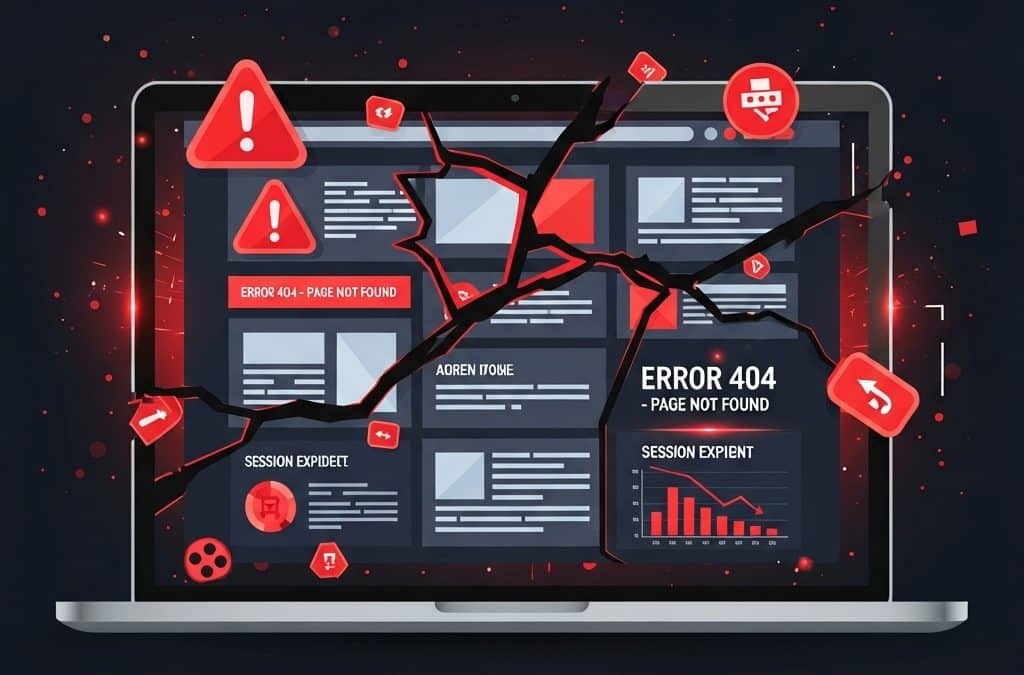
Get a Free Website AuditWebsite Design Mistakes: 1 — Slow Loading Speed
Slow loading speed is the single most damaging website design mistake for South African businesses — because SA users are predominantly mobile, on variable data connections, and more likely than desktop users to abandon a slow site before it finishes loading. According to Google’s mobile page speed research, a site that loads in 5 seconds sees 90% more bounces than one loading in 1 second. For a site receiving 1,000 visitors per month, that difference in bounce rate represents hundreds of lost potential customers every single month.
What slow loading looks like in practice: A Johannesburg service business with a 6-second mobile load time is losing over 70% of mobile visitors before they see a single product or service. Every rand spent on Google Ads or SEO driving traffic to that site is partially wasted — because the site itself is leaking visitors before they convert.
How to Fix It
Compress images before uploading — a 3MB hero image should be under 200KB. Use WebP format where possible. Choose quality SA hosting with servers close to your audience. Remove plugins you are not actively using — every plugin adds code that loads on every page. Enable caching and use a CDN like Cloudflare to serve your site faster to South African users.
Key Takeaway
Website design mistakes related to speed are the most expensive because they affect every other marketing investment. Fast SEO, Google Ads, and social media traffic still converts poorly if it lands on a slow site. Fix speed first — it is the foundation that makes every other improvement more effective.
Website Design Mistakes: 2 — No Clear Call to Action
Missing or weak calls to action are website design mistakes that happen when businesses focus on looking good instead of guiding visitors toward action. Every page on your site needs one clear, obvious next step — and most SA business websites either have no CTA, have one buried at the bottom, or have so many competing options that visitors choose none of them.
The most common SA website CTA mistake: A services page that lists everything the business offers in detail — then ends with a small “Contact Us” link at the bottom in the same size and colour as all other links. Visitors who reached the bottom interested are not being guided to act. They are being left to find the contact page on their own — and many do not bother.
What effective CTAs look like: A contrasting button above the fold (“Get a Free Quote Today”), a second CTA mid-page after the main value proposition (“Book Your Free Consultation”), and a third at the end (“Ready to get started? Contact us now”). Action language that states the benefit: “Get a Free Quote” beats “Submit.” “Book Your Free Consultation” beats “Contact Us.”
How to Fix It
Decide on one primary action per page. Place a CTA button above the fold, in the middle of content, and at the end. Use contrasting colours so the button is impossible to miss. Use action language that states what the visitor gets — not what they do.
Is your website guiding visitors to convert — or leaving them to find their own way out?
Get a Free Conversion ReviewWebsite Design Mistakes: 3 — Poor Mobile Experience
Poor mobile experience is one of the most expensive website design mistakes in the South African market specifically — because over 70% of SA internet traffic comes from mobile devices, predominantly Android smartphones on variable data connections. A site that is functional on desktop but broken on mobile is effectively broken for the majority of your visitors.
Poor mobile experience is not just visual: It is buttons too small to tap accurately, text that requires horizontal scrolling to read, forms with 10 fields that take 3 minutes to complete on a phone, and navigation menus that open incorrectly or cover the content. Each of these individually drives abandonment. Combined, they make a site practically unusable for mobile users.
How to Fix It
Test your site on an actual phone — not a resized desktop browser. Make buttons at least 44 pixels tall. Simplify mobile navigation to a clean hamburger menu with key pages. Reduce form fields on mobile versions — if your desktop form has 10 fields, your mobile version should have 5. A credible web design service builds mobile-first, meaning the phone experience is designed before the desktop version, not adapted from it afterwards.
Website Design Mistakes: 4 — Confusing Navigation
Confusing navigation is a website design mistake that destroys conversions silently — because visitors who cannot find what they need within a few clicks simply leave without telling you why. SA analytics tools show high bounce rates and low time-on-site for sites with poor navigation, but they do not tell you the underlying cause. Complicated menus, vague page labels, and buried information all reduce the chance that visitors reach the pages that convert.
Navigation mistakes we see constantly: Main menus with 12+ items at the same visual hierarchy. Page labels like “What We Do,” “Our Story,” and “Get in Touch” instead of “Services,” “About,” and “Contact.” Important service pages buried three levels deep. No clear path from the homepage to a quote or booking form.
How to Fix It
Limit your main navigation to 5–7 items. Use clear, descriptive labels — “Services” over “What We Do,” “Pricing” over “Investment Options.” Ensure your most important pages are reachable within two clicks from anywhere on the site. Add site search if you have more than 20 pages.
Key Takeaway
Website design mistakes in navigation are particularly damaging because they affect every visitor regardless of how they arrived. A visitor from Google Ads who cannot find your pricing page within two clicks is a paid lead you have lost. Navigation fixes often produce the fastest measurable conversion rate improvements because they reduce friction for visitors who are already interested.
Website Design Mistakes: 5 — No Trust Signals
Missing trust signals are website design mistakes that are especially costly in the South African market — because SA consumers have legitimate concerns about online fraud and are more cautious about entering payment details or contact information on unfamiliar websites. A site with no visible reason to trust it will consistently lose sales to competitors whose sites signal credibility clearly.
What a site without trust signals looks like: No physical address. No phone number — just a contact form. No customer reviews or testimonials. No SSL badge or payment gateway logos. No case studies or portfolio. No media mentions or industry credentials. This is the profile of a site that looks like it could disappear overnight — because to a visitor who has never heard of your business, it could.
What effective trust signals look like for SA businesses: Customer testimonials with real names, photos, and specific results. PayFast or Peach Payments logos at checkout. A physical Johannesburg or Cape Town address in the footer. Google reviews displayed prominently. Case studies with actual numbers — “We helped [client] increase online sales by 40% in 6 months.” Industry certifications or membership logos. Media mentions from SA publications.
How to Fix It
Add testimonials with real names and photos above the fold on key pages. Display payment gateway logos at checkout and on pricing pages. Include your physical address and phone number in the footer on every page. Add case studies with specific, verifiable outcomes. If you have media mentions or awards, display them prominently.
Website Design Mistakes: How These Five Compound
These website design mistakes rarely exist in isolation — and their effects compound. A slow site with poor mobile experience and no clear calls to action creates a triple conversion penalty. Each problem amplifies the others. The good news is that fixing them compounds too. A faster site improves mobile experience. Clear CTAs work better when navigation is simple. Trust signals boost conversions across every page on the site.
If you are ready to fix these issues with a professionally built SA website, our web design services team builds conversion-focused websites for South African businesses — correctly structured, mobile-optimised, and built to convert from day one.
Website Design Mistakes: Frequently Asked Questions
What are the most common website design mistakes South African businesses make?
The five most common website design mistakes for SA businesses are slow loading speed (especially on mobile), missing or weak calls to action, poor mobile experience, confusing navigation, and no trust signals. Most SA business websites have at least two or three of these issues simultaneously — and their combined effect on conversion rates is significantly worse than any single issue alone.
How much does a slow website cost a South African business?
Google’s research shows that a site loading in 5 seconds has 90% more bounces than a site loading in 1 second. For a SA business spending R5,000 per month on Google Ads driving 500 visitors, a high bounce rate from slow loading means potentially R3,000 to R4,000 of that spend is wasted on visitors who leave before engaging. Fixing page speed is one of the highest-ROI improvements any SA website can make.
How do I know if my website has conversion problems?
Open your website on your phone and time how long it loads. Try to find your most important service or product page. Look for a clear call to action above the fold. Check whether your contact details and trust signals are visible without scrolling. If any of these fail the test, your website is costing you customers. Google Analytics and Google Search Console also show bounce rates and pages where visitors drop off.
How long does it take to fix website design mistakes?
Quick fixes like image compression, adding CTA buttons, and updating navigation labels can be done in hours. More structural fixes like mobile optimisation, site speed improvements, and adding trust signals typically take 1–2 weeks with a developer. A full website rebuild addressing all five issues typically takes 4–8 weeks. The ROI on fixing these issues is almost always immediate — conversion rates improve as soon as the changes go live.
Is your website making these mistakes and costing you customers every day?
Get a Free Website Conversion AuditReady to Fix What Is Costing Your SA Website Conversions?
Growth Pulse Media audits and rebuilds South African business websites — fixing speed, mobile experience, navigation, CTAs, and trust signals so your site converts visitors into leads and customers. No obligation — we will get back to you within 24 hours.
Get Your Free Website Audit